In 2008, China surprised the world by hosting an incredible Olympic Games and in 2022, the Chinese capital wants to repeat this success, now hosting the Winter Olympic Games, a smaller and (much) colder version of the competition. However, a lot has changed between these two competitions. Fourteen years ago, China wanted to show to the world that they were a global power. Today, everybody knows this as Chinese companies, products and news about the country are everyone, so the message of the games has changed. There are many ways to show this, however one of the most (if not the most) memorable is the look of the games.
What is the look of the games?
The look of the games is what we call “Visual Identity” in companies and marketing agencies. Today, almost all companies have its brand guidelines, a manual where employees and clients can check elements like logo, typography, taglines, and pictures to help to create artworks and other designs to promote the company in an uniform way to create a sense of unity.
In the Olympic Games, this challenge to create a Visual Identity is taken to the next level, because here, we are not creating something that represents a single company, but an entire country. How to create a look that will represent an entire nation to billions of people? How to create a visual that will be in historic moments that will be filmed, registered, and shown to generations to come? How to make such different artworks like stadiums banners and small pins look like they come from the same place and have the same look and feel?
This is the magic of the look of the games.

Visual of the Sochi 2014 Winter Olympics. Look how the images seem connected to each other, even being so different at the same time. From the shapes used in the stadium banner to the shapes used to create the medals.
The look of the games is essential to everybody. To the people watching at home, because it allows them to distinguish the games from any other event. To the people working broadcasting the games, because it allows them to understand the atmosphere and broadcast this feeling to the entire world. And of course, to the spectators and athletes, who can enter the venues to experience memorable moments and think “this is history being made”.
The history of the looks
For more than half a century, the Olympic games only had one poster or logo to create its visuals. However, this all changed in 1964 when Tokyo hosted the games. Japan faced a problem that no other country faced before: an enormous language barrier challenge. This was the first time that the games happened in an Asian country and the first time that it was hosted in a place where they used a language that didn’t use the Latin alphabet. This was a problem for communication. How to easily guide and make the games memorable for foreigners who never learned the Japanese writing system?
The answer: Communicate with design. The organizing committee had the incredible idea to share the Olympic message using hundreds of different artworks but using one consistent design. From this moment, everything related to the competition has a similar design style. Once you have contact with one image, you can relate all the other ones with the Olympics. This was the moment that the look of the games was created.

You don’t need to understand Japanese to know that all these images are related to each other.
Another interesting feature that the Tokyo 1964 games also brought were the pictograms. The idea was to communicate the sports to everyone, regardless of their language. They created 20 different pictograms for each sport. This design feature was so popular that all Olympic games created their own pictograms ever since.

Additionally, they also developed another 39 pictograms representing places like hotels, restaurants, healthcare centers and toilets. This was the very first time that the traditional toilet icon was used in a big international event. All of them are simple and easy to understand, are stylistically consistent and distinct from each other.

It is not just the logo
Many people believe that the look of the games is just the logo or a poster, but it is much more than this. The logo is in fact very important because it is the starting point of the entire designing process. However, the look of the games is complete only when we have guides and visuals for the secondary elements which are the backgrounds, the typography, the colors, and other elements that unite the branding of the games.

Beijing 2008
Hosting the Olympic Games is frequently a turning point for a city or a country. In 1964, Tokyo hosted the games, and it became a symbol of Japan’s rebirth after World War II. When Seoul hosted the event in 1988, it was the first time that the Republic of Korea took the center stage and in 1992, Barcelona became one of the most famous tourist destinations in the world.
China wanted to create an Olympic Games like no other to put modern China on the map and create an unforgettable show. This is reflected in their visual identity that can be defined in a single word: Distinguish. It was different from everything tried before. The design team decided to insert traditional Chinese elements and instead of choosing the national flag color as the main element, they chose four colors: Red (China), Yellow (Sun), Lime Green (Land), and Blue (Sky).

Uniting these elements is an old design called the Clouds of Luck which was used in many venues and elements like the olympic torch, cauldron and the official TV Intro.

There was a message here. It was a design created by China to the world. It is made with Chinese elements that may be familiar for those who live in the country, but it is a new element for those coming from abroad. The world was seeing China at the center stage for the first time in centuries. And it really was memorable. This design pattern is now eternalized though videos and pictures showing the historical records of Michael Phelps and Usain Bolt.
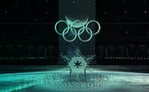
Beijing 2022
This is the second time that the Chinese capital hosts the games. Now the message is very different from the previous version. Now, China has been a global power for almost two decades and has hosted many other international events like the World Expo in 2010 in Shanghai. China doesn’t need to present themselves to the world once again. However, there is a different focus on this time. The main message is not targeting the global audience but also the Chinese audience who is not very familiar with winter sports. Much of the Chinese population don’t even have experience with snow because a large portion of the country is in a subtropical or dry area. In other words: It is a design created by China for China.
Of course, this design was thought to impact international audiences as well, but this time there was virtually no focus on traditional Chinese elements, the main theme was technology and winter. They didn’t use too many traditional elements or even traditional colors like red. The look of the games was more focused on snowcapped mountains and skyscrapers.

This is very visible when we compare the two opening ceremonies. While the 2008 ceremony is focused in the past, the 2022 ceremony is focused in the present and future.

The look of the games was revealed in 2017, and it was highly influenced by some design trends of that time like vector illustration and minimalistic design.

More than the visual material for the games, the look represents the culture and wishes of an entire nation.