How the color palette can change the way we view a movie or TV series

Over a decade ago, I read Phillip Pullman’s The Subtle Knife, part of the His Dark Materials trilogy that has become one of my favorite books. I fell in love with the characters, the story, the places, the visuals… wait  the visuals? The books don’t even have pictures. How could I be impressed with the visuals of a book?

I created the visuals in my head, following the author’s description, but what I didn’t notice is that other things influenced me in this visual construction and I didn’t become aware of this until I watched the second season of the HBO/BBC series His Dark Materials, which was inspired by the book The Subtle Knife.

The TV series is really beautiful, one of the most beautiful of the year. However, when I watched the trailer for the first time, I felt that something didn’t seem very familiar to me… but what could it be? The scenarios of the television series were shown in a very similar way to those narrated in the book, but even with all that fidelity, there was something very strange to me about it all. After some time, I noticed that the difference between what I imagined and what the series showed was not in the sets themselves, but in the color palette chosen to represent them.


How visuals affect our emotions

The color palette is one of the most important aspects (if not the most important) in an audiovisual production. Even if we don’t notice, it can tell a story and its intentions.

There are three important elements when creating a color palette: Hue, Saturation and Brightness, also known as HSB.


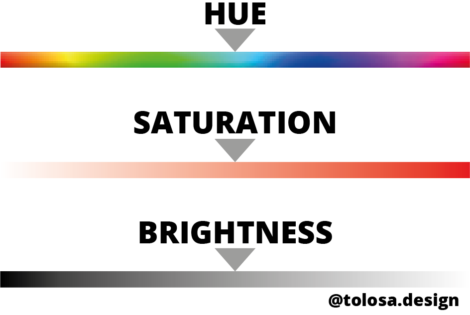
Hue is the color itself. With it, you can create a look with many colors or just one. One of the most famous cases is from the movie The Matrix.

Não foi fornecido texto alternativo para esta imagem

Note that there is a predominant color: green. The visual artists chose this color because it refers to computer codes and emphasizes that you are watching a story that takes place inside a computer, in a virtual world. The same colors appear on the film’s logo and poster. In this way the team not only created a color palette, but a visual identity for the film.

Saturation is one of the other elements. It indicates the intensity of the color chosen in the previous step. The higher the saturation, the more colorful the film appears. If the saturation is too low, the visuals will be close to black and white video. Generally, children’s stories are more colorful and saturated while content for adults tend to have lower levels of saturation.

A classic example of a good use of saturation is the Harry Potter series. With each new film, the color palette becomes less saturated, causing them to gradually lose their childlike appearance as the characters grow. This is a representation of the characters transition from children to adults.

Não foi fornecido texto alternativo para esta imagem

And last but not least, we have Brightness, which is the intensity of light, which can be bright or dark. Batman is a classic example. The original comics, most films and game adaptations are dark. This reflects the tone of the film, the violence of the city, the fear of the population and Batman himself, after all he is called the Dark Knight.

Não foi fornecido texto alternativo para esta imagem


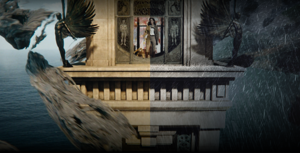
Back to His Dark Materials

The color palette. The HSB. That’s the reason the TV series seems so strange to me. When I read the book I was highly influenced by the 2009 film Harry Potter and the Half-Blood Prince, which was not very saturated and had green and gray as the main colors of its palette. The book’s main character, Will Parry, also helped create this darker atmosphere as he has a colder personality compared to Lyra Silvertongue, protagonist of the first book in the series.
 
After thinking about it, I edited some footage from the series to recreate some scenes from the color palette I had envisioned when I read the book, but first of all, I have to say that I really liked the look of the TV series. It is completely different from what I had imagined, but still very beautiful.
 
I’m not criticizing the series at all. I’m just showing how the story can be told in a different way just by changing the color palette. When I read the book, I felt a darker tone in the story, as the series shows the environments more vividly.
 
Não foi fornecido texto alternativo para esta imagem
 The original version (top) and my edited version (bottom)
The first notable difference is the hue chosen. While the TV series has a color palette focused on blue and yellow, my mental image mixes green and dark blue.
Não foi fornecido texto alternativo para esta imagem

Another difference is saturation, with the TV series being much more saturated.

Não foi fornecido texto alternativo para esta imagem

The last difference is the brightness, with my version being darker than the series.

Não foi fornecido texto alternativo para esta imagem

Não foi fornecido texto alternativo para esta imagem

Não foi fornecido texto alternativo para esta imagem

Não foi fornecido texto alternativo para esta imagem

Não foi fornecido texto alternativo para esta imagem

Não foi fornecido texto alternativo para esta imagem

Não foi fornecido texto alternativo para esta imagem

Thanks for reading this article. What are your thoughts on the TV series’ color palette? Did you have any other ideas too? Feel free to share this post.

Leave a Comment

Your email address will not be published. Required fields are marked *